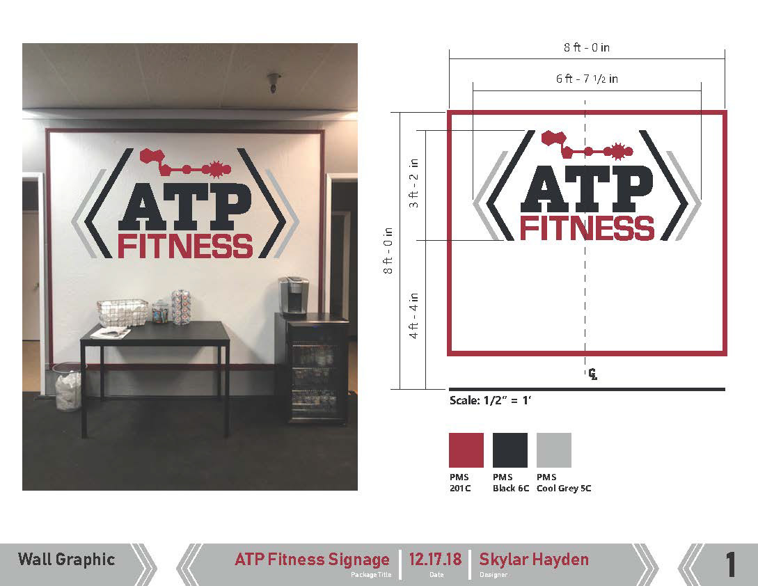
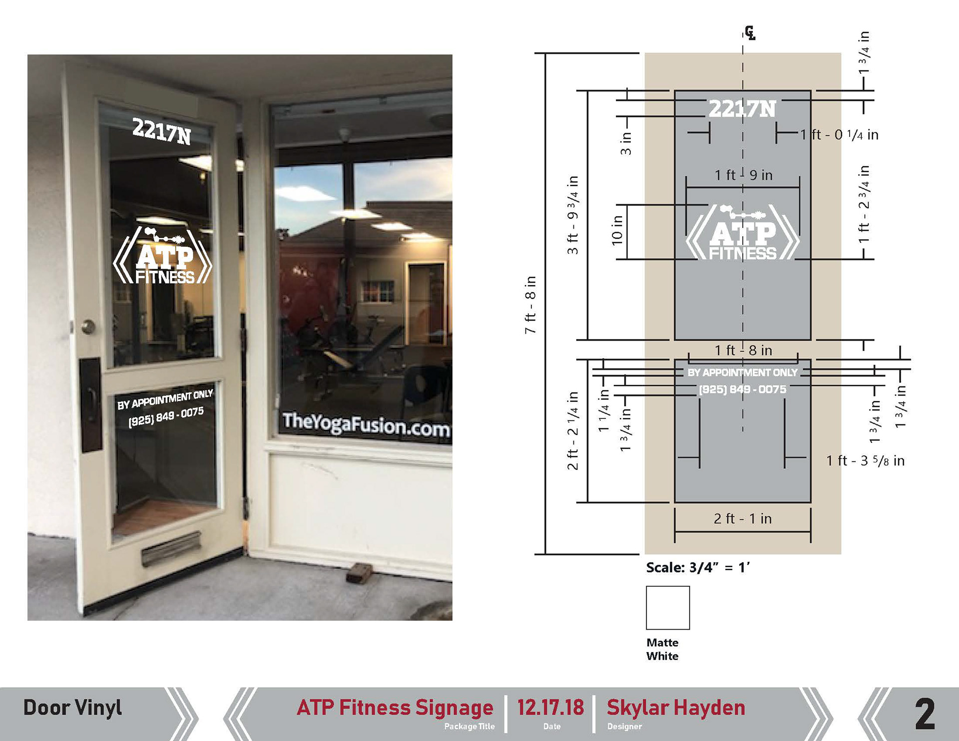
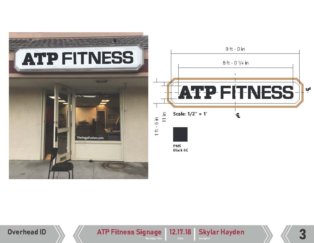
ATP Fitness -
Logo & Signage
Logo & Signage
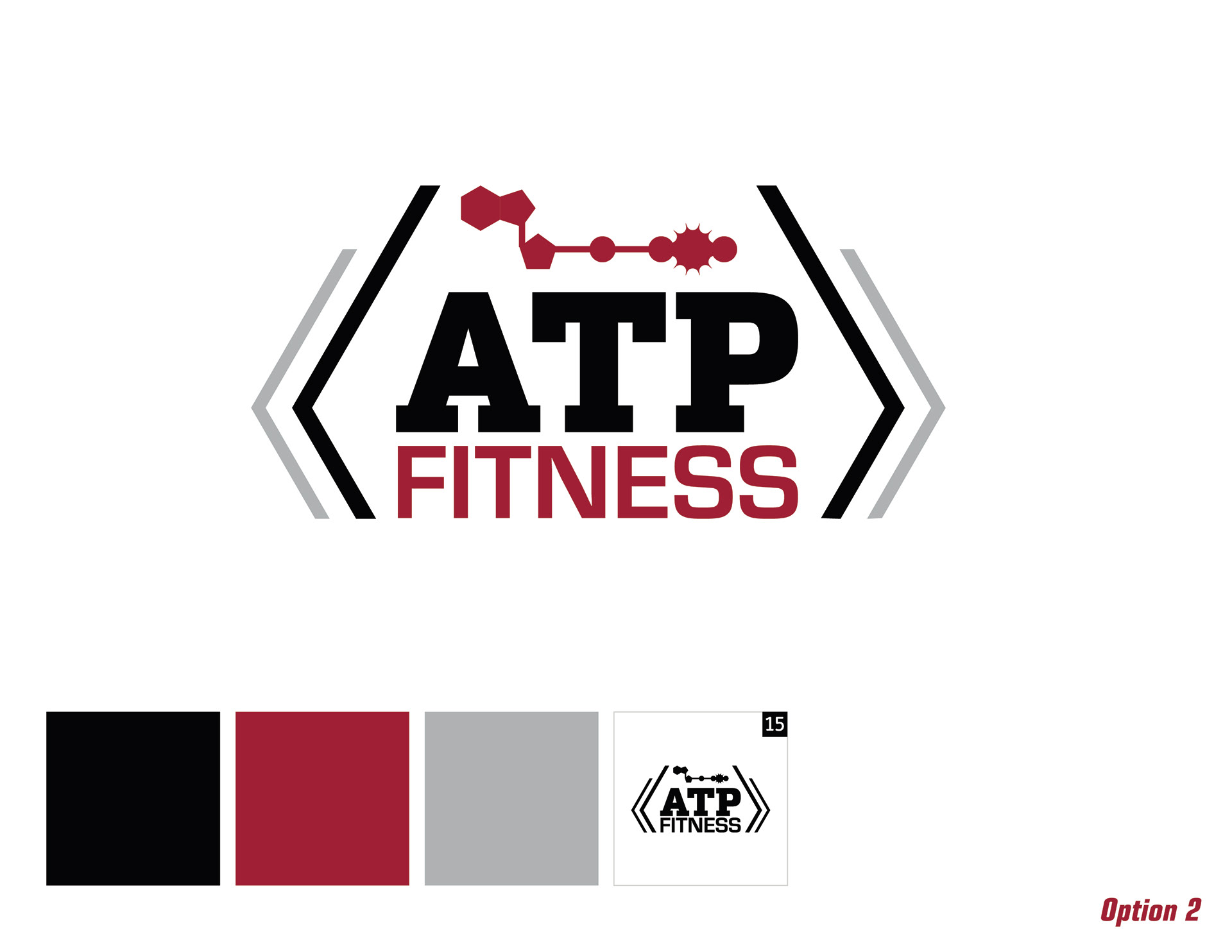
I created a logo and signage designs for ATP Fitness when they first launched in
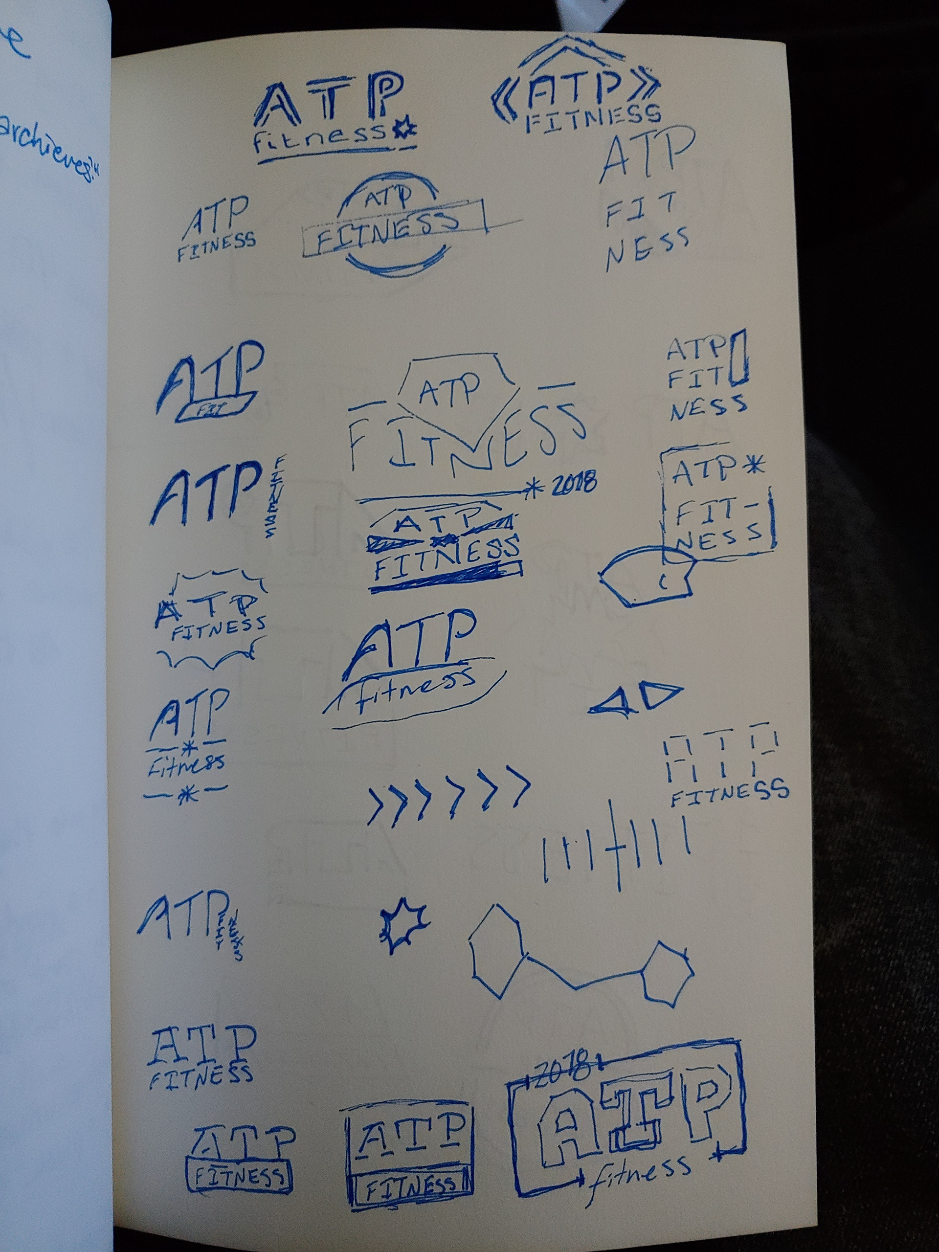
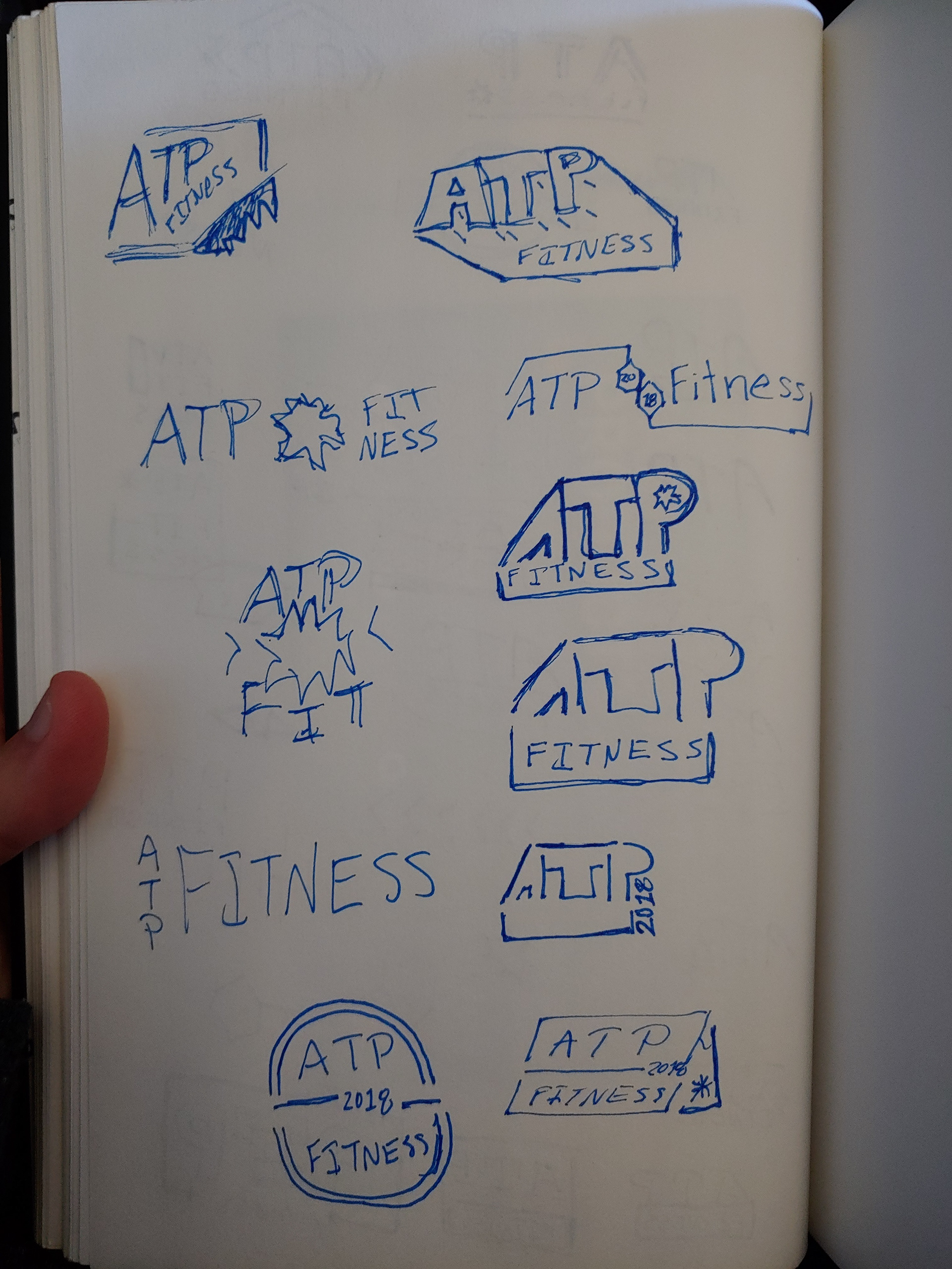
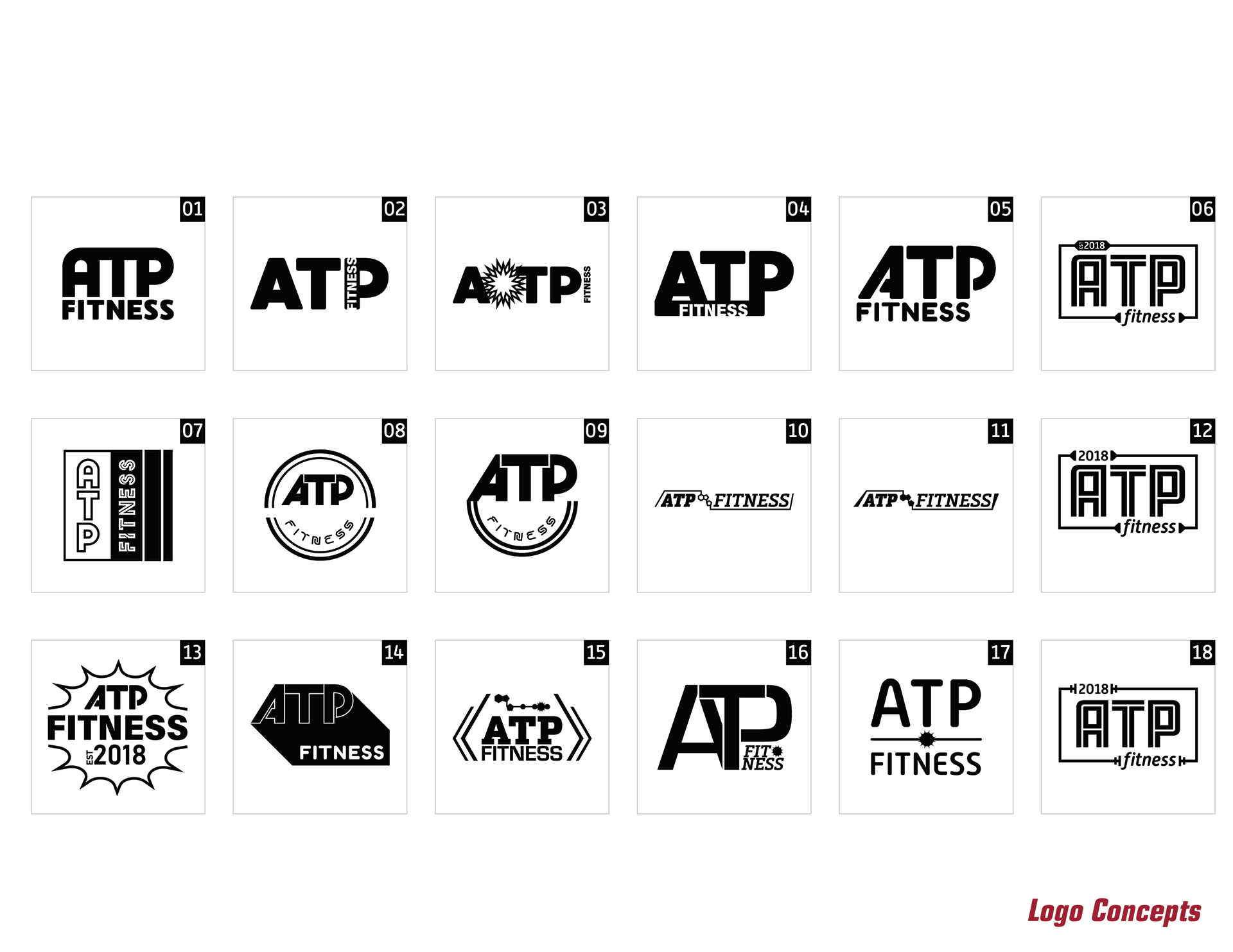
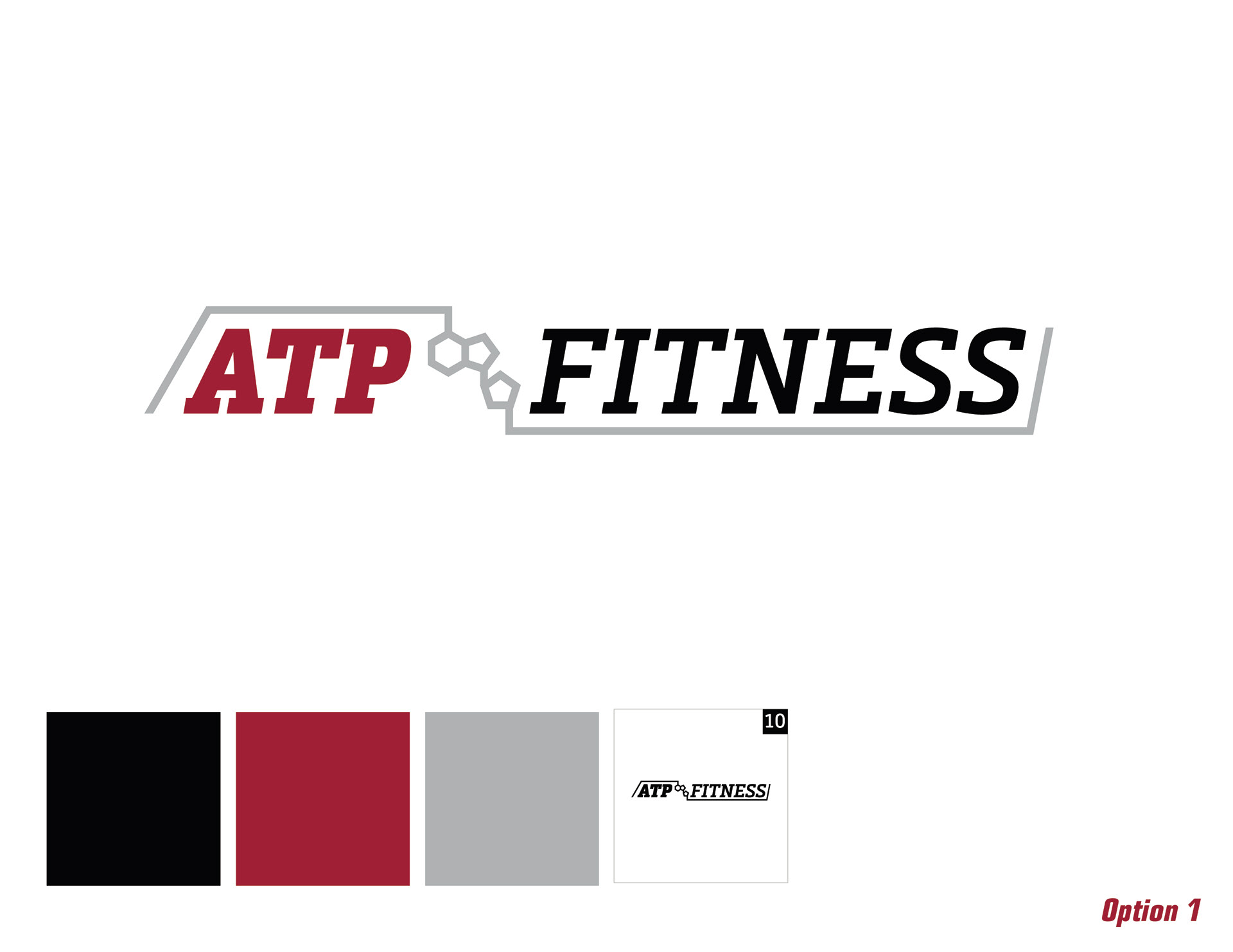
San Ramon, CA. They requested a logo that felt upscale, assertive, and energetic, while also referencing the scientific origin of their name. The client had already determined the color palette of burgundy, grey, white and black. Through exploring typefaces, text proportions, logo shape, and additional linework, I created 18 initial concepts. After a few rounds of concept refinement with the client, I was able to create a mark they really loved for their space.
San Ramon, CA. They requested a logo that felt upscale, assertive, and energetic, while also referencing the scientific origin of their name. The client had already determined the color palette of burgundy, grey, white and black. Through exploring typefaces, text proportions, logo shape, and additional linework, I created 18 initial concepts. After a few rounds of concept refinement with the client, I was able to create a mark they really loved for their space.


Brand Development


Signage